For those of you not familiar with him, Ander Zorn was a Swedish artist born in 1860 and died in 1920. He was Sweden's premier artist and painted portraits of the King of Sweden, Presidents William Taft and Grover Cleveland, among other notable people. He also painted landscapes. What is most interesting about Zorn is his palette. He only used 4 colors. They were Ivory Black, Vermillion, Yellow Ochre and Flake White. It is said that on occasions he would add or replace a color with Cerulean Blue at times.
Anyway with just the four above mentioned colors he turned out paintings like these:


For me this is amazing. Now mind you he is not the only one or the first to do this but his work stands out. I thought this would be a good place to start because there are only 4 colors to use and everything can be mixed with those four. Also this would give my eyes a chance to see the different shades and tints one can create.
So I mixed up a small Zorn palette using the before mentioned colors. Here they are:

Across the top are Ivory Black, Vermillion, Yellow Ochre and Flake White

From Left to right: Black mixed with Vermillion, Vermillion mixed with Yellow Ochre, Yellow Ochre mixed with Black, White mixed with Black and then Black mixed with White in a different ratio.

Next to each color is its tint which is the base color mixed with white.
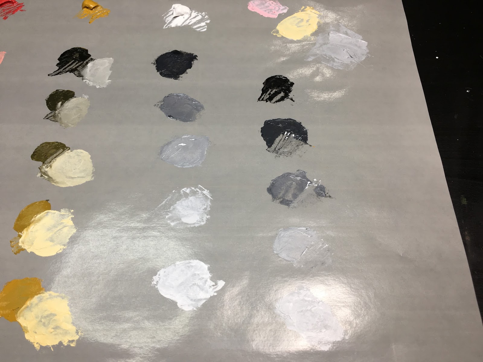
The rest of the tint colors.

The three colors in the upper right are Red mixed with White, Yellow ochre mixed with White and Black mixed with white.
The combinations are almost endless. I only did a few to practice.
To continue practicing I decided to paint two 28mm figures. Both are from Foundry.
I forgot to take a before photo of the 1700s gentleman.


All of the colors on this figure's uniform was came from the Zorn palette. I will over the next few days go and add highlights and more shadows. I used a glazing technique so the oil paint will dry faster. So each layer of paint I put on will allow the previous layers to show through creating a deep rich color.
This is the other figure I did:


These photos are the before painting. I primed the figure with Black and allowed that to dry a little. I then went and sprayed White over the Black. Doing that allowed shadows and highlights to appear. There is a term for this type of priming but I forget what it is called.


Now the figure after I applied its first glaze of colors. I still have to go back and paint the hair.
I hope you liked this post. Once I get some more glazes done on both figures I will put up another post about their progress.
Until then stay well.
Brilliant brush work! The final results of your gentleman figure are highly commendable - quite professional in look. It will be interesting to see the final result with your female figure. I only say that because hair colors always prove to be a challenge for me. Again, well done.
ReplyDeleteVery nice! So is the olive drab sort of color on the wist coat and cuffs a combination of yellow ochre, white, and a little black?
ReplyDeleteactually it was just Black and Yellow Ochre. No white.
DeleteVery instructive!
ReplyDeleteThank you for sharing!
Cheers,
DintheDin